Overview
Welcome to our blog
Below, you’ll find fresh ideas, tourism trends and Bókun know-how. All part of your passport to success.
Dive in
All Articles Bókun News and Updates Channel Management Grow Your Bookings Increase Revenue OTAs and Resellers Streamline Operations Trends and Industry News
Sam Jefferies • June 11, 2026
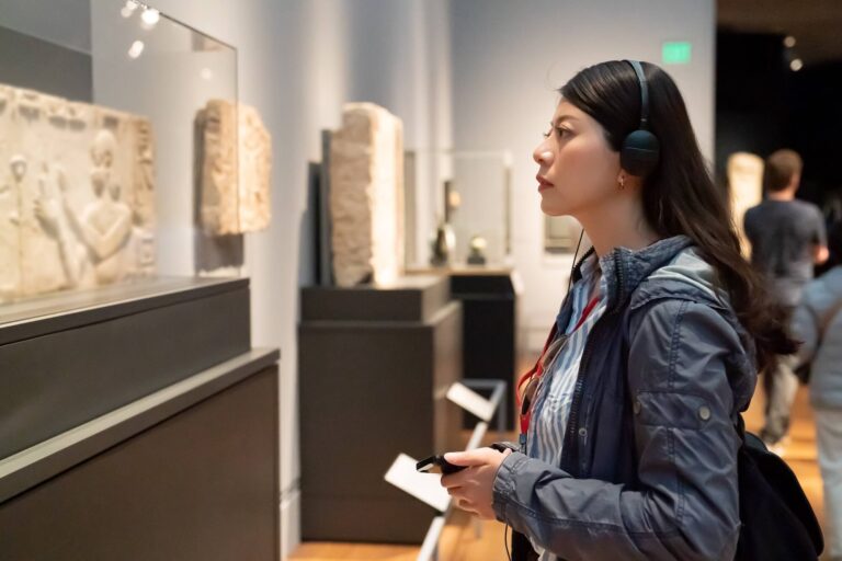
Best Museum Booking Software (2026 Comparison Guide)
Sam Jefferies • June 11, 2026
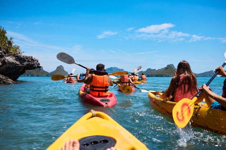
14 Best Kayak Rental Software (2026 Comparison Guide)

Sam Jefferies • June 10, 2026
How to Create a Booking Website for Tour Operators (in 5 Steps)

Sam Jefferies • June 9, 2026
How to Start a Food Tour Business & Sell Out Your First Tours
Sam Jefferies • June 9, 2026
How to Become a Musement Supplier in 5 Simple Steps (2026)

Sam Jefferies • June 9, 2026
TicketingHub Pricing Guide: What to Know Before You Buy (2026)

Charlotte Gannon • June 8, 2026
The experience trends defining Summer 2026
Charlotte Gannon • June 3, 2026
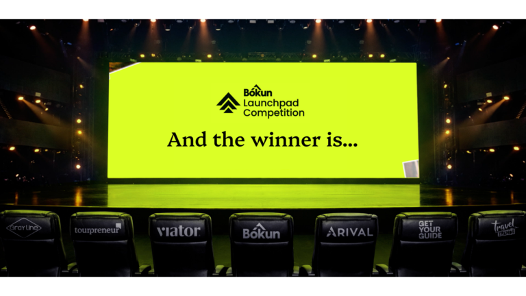
Bókun Launchpad 2026: The experience ideas that stopped us in our tracks
Maya Patel • June 3, 2026
Meet Dazhboards: the AI layer for Experience Operators who’d rather run tours than chase paperwork

Maya Patel • May 28, 2026
AI is already changing the game. Here’s what GetYourGuide’s Spring 2026 report says you need to do

Charlotte Gannon • May 27, 2026
Going back to go forward: why ancestry travel is reshaping experiences

Sam Jefferies • May 21, 2026
Best Charter Boat Booking Software (2026 Comparison Guide)

Sam Jefferies • May 15, 2026
Best Cooking Class Booking Software (2026 Comparison Guide)

Sam Jefferies • May 15, 2026
Bookeo Pricing Guide: What to Know Before You Buy (2026)

Charlotte Gannon • May 15, 2026
How to create combo products guests actually want
Charlotte Gannon • May 12, 2026
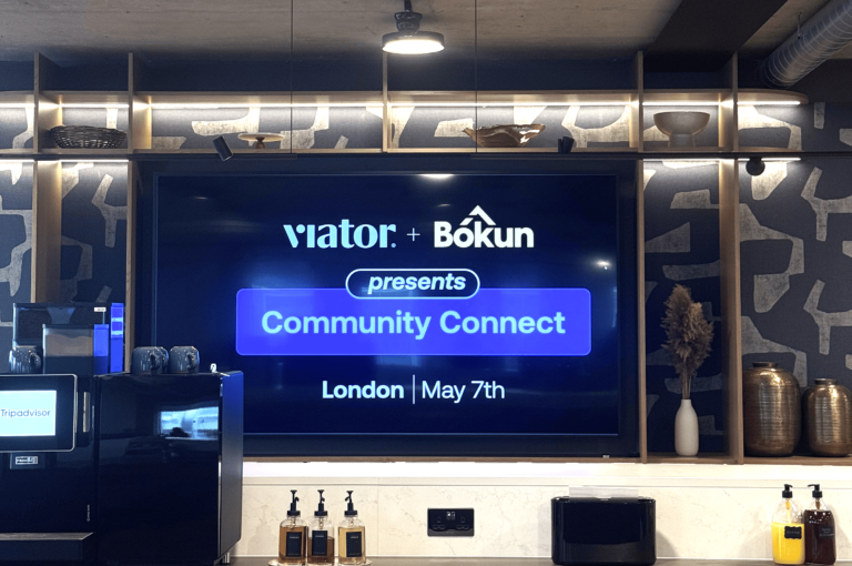
Bókun x Viator: London in action

Barbara Vidal • May 8, 2026
Why we’re changing the way Bókun ships product
Charlotte Gannon • May 6, 2026
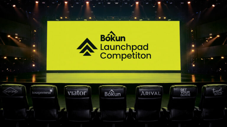
Got an experience idea? Pitch it. Win $10,000.
Charlotte Gannon • May 6, 2026
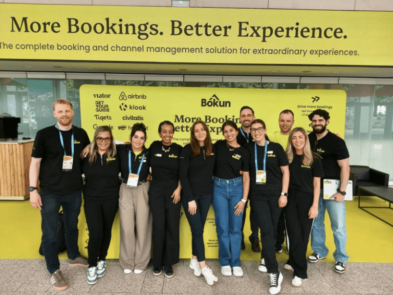
Bókun’s Arival Valencia 2026 takeaways in a nutshell
Sam Jefferies • May 4, 2026
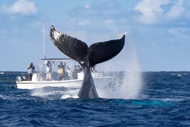
12 Best Whale Watching Booking Software (2026 Comparison Guide)

Sam Jefferies • May 4, 2026
20 Top-Rated Tour Operator Software (2026 Comparison Guide)

Sam Jefferies • April 3, 2026
8 Best Zipline Booking Software (2026 Comparison Guide)

Sam Jefferies • April 1, 2026
12 Best Online Booking Software for Brewery Tours

Sam Jefferies • March 31, 2026
PEAK 15 Systems Reviews & Alternatives (2026 Guide)

Sam Jefferies • March 31, 2026
Bókun’s Step-by-Step Guide to Become a Klook Supplier (2026)
Sam Jefferies • March 31, 2026
How to Become a TourRadar Supplier (2026 Guide)

Charlotte Gannon • March 13, 2026
Celebrating the spirit of experiences: A look back at our Photo Competition
Sam Jefferies • March 11, 2026
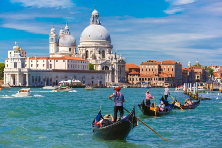
Expedia Supplier Guide for Tour & Activity Providers (2026)

Sam Jefferies • March 11, 2026
Best Ticketing Systems for Visitor Attractions in 2026

Sam Jefferies • March 3, 2026
8 Best Rage Room Software Solutions (2026 Comparison Guide)

Sam Jefferies • February 26, 2026
Beyonk & BookingHound Pricing Guide (2026 Buyer’s Guide)

Charlotte Gannon • February 26, 2026
Brand or bust: why experience operators need brand marketing now
Charlotte Gannon • February 19, 2026
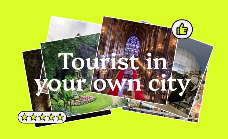
Tourist In Your Own City: How to Boost Local Bookings

Sam Jefferies • February 17, 2026
Ventrata Pricing Guide: What to Know Before You Buy
Sam Jefferies • February 10, 2026
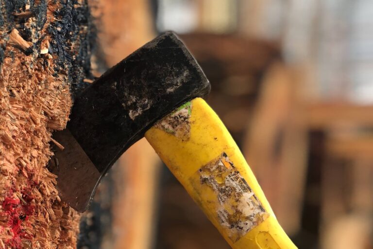
11 Best Axe Throwing Booking Software in 2026

Sam Jefferies • February 9, 2026
9 TicketingHub Alternatives: 2026 Comparison Guide

Sam Jefferies • February 9, 2026
Payment Processing for Tour Operators: A Complete Guide

Sam Jefferies • February 6, 2026
The Complete Guide to Tour Operations Management
Charlotte Gannon • January 28, 2026
From Blue to Bold: How We Rebranded to Match Our Ambition

Sam Jefferies • January 15, 2026
TrekkSoft Pricing Guide: What to Know Before You Buy

Charlotte Gannon • January 15, 2026
The travel trends shaping how we’ll explore in 2026

Sam Jefferies • January 13, 2026
How to Become a Civitatis Supplier in 3 Simple Steps

Maya Patel • January 13, 2026
Bókun Recognised as GetYourGuide Premium Connectivity Partner for 2026

Sam Jefferies • January 13, 2026
10 Best Boat Rental Management Software Guide
Sam Jefferies • January 12, 2026
Best Tour Operator Software with Inventory Management

Sam Jefferies • January 11, 2026
Regiondo Pricing Guide: What to Know Before You Buy (2026)
Sam Jefferies • December 20, 2025
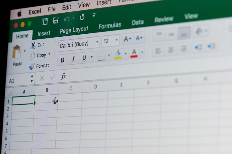
Creating a Booking System in Excel: How It Works + Alternatives

Sam Jefferies • December 19, 2025
The Tour Operator’s Guide to OTA Bookings (2026)

Maya Patel • December 18, 2025
More Reach, Less Effort: How Our Newest Partners Are Growing Your Business

Sam Jefferies • December 16, 2025
6 Best Escape Room Booking Software for 2026

Sam Jefferies • December 16, 2025
Xola Pricing Guide: What to Know Before You Buy
Maya Patel • December 16, 2025
Still Think OTAs Steal Your Bookings? The Data Says Otherwise

Maya Patel • December 11, 2025
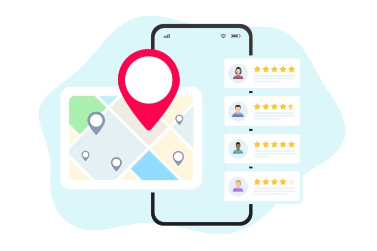
How Reviews Can Boost Visibility and Sales

Sam Jefferies • December 10, 2025
10+ Benefits of Online Booking Systems for Tour Operators & Tourists

Sam Jefferies • December 10, 2025
Rezdy Pricing Guide: What to Know Before You Buy (2026)
Sam Jefferies • November 26, 2025
8 Best Checkfront Alternatives: 2026 Comparison Guide

Sam Jefferies • November 24, 2025
Best Booking Software for Walking Tours in 2026

Sam Jefferies • November 23, 2025
8 Best Bus Tour Reservation Software in 2026

Sam Jefferies • November 18, 2025
FareHarbor Pricing Guide: What to Know Before You Buy (2026)

Sam Jefferies • November 14, 2025
Tour & Activity Booking System Pricing Comparison Guide

Sam Jefferies • November 4, 2025
Best Excursion & Adventure Tour Booking Software in 2026

Sam Jefferies • November 4, 2025
Best Booking Software for Food Tour Companies in 2026
Sam Jefferies • October 31, 2025
Travel Affiliate Networks for Tour Guides to Connect with Partners

Sam Jefferies • October 30, 2025
11 Best Alternatives to Orioly: 2026 Comparison Guide

Charlotte Gannon • October 30, 2025
How to Create & Market Five-Star Tour Packages

Sam Jefferies • October 16, 2025
Best Bike Tour Booking Software Guide

Sam Jefferies • October 2, 2025
8 Rezgo Alternatives: 2026 Comparison Guide

Sam Jefferies • October 2, 2025
8 Top-Rated Xola Alternatives: 2026 Comparison Guide

Sam Jefferies • September 26, 2025
Resmark Systems: Reviews & Alternatives Guide

Sam Jefferies • September 22, 2025
TripWorks Pricing Guide: What to Know Before You Buy (2026)

Sam Jefferies • September 16, 2025
8 Ways to Increase Direct Tour Bookings from Your Website

Sam Jefferies • September 16, 2025
Checkfront Pricing Guide: What to Know Before You Buy (2026)

Sam Jefferies • September 12, 2025
SEO Strategies for Tour Operators: Earn More Website Bookings

Sam Jefferies • September 12, 2025
7 Ways to Earn More Tripadvisor Reviews

Sam Jefferies • September 12, 2025
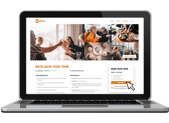
Bókun’s Free Tour Operator Website Templates

Sam Jefferies • August 4, 2025
Peek Pro Pricing Guide: What to Know Before You Buy (2026)

Sam Jefferies • July 24, 2025
How to Add a Tour Booking System to Your Website

Sam Jefferies • July 14, 2025
Best Tour Booking Plugin for WordPress | Bókun + 5 Other Tools
Sam Jefferies • July 14, 2025
How to Maximise Website Bookings with a Book Tour Button
The Bókun Team • July 14, 2025
Google Things to do: How to Get Listed & Everything to Know
Sam Jefferies • July 3, 2025
What Is a Reservation System? (And Bókun’s Solution)

Charlotte Gannon • July 2, 2025
Extra-Tour-Estrial: To Bókun and Beyond

The Bókun Team • June 18, 2025
How to Add Your Business to Tripadvisor

Sam Jefferies • June 17, 2025
3 Ways to Create an Online Booking System (+ Bókun’s Solution)

Sam Jefferies • June 13, 2025
8 Best Setmore Alternatives for Tour & Activity Operators

Sam Jefferies • June 10, 2025
Bókun vs. FareHarbor vs. Peek Pro: 2026 Comparison Guide

Sam Jefferies • June 10, 2025
What is the FareHarbor Distribution Network? (& How to Join)

Charlotte Gannon • June 4, 2025
How social media boosts Experience bookings – and how to maximise it
Charlotte Gannon • May 19, 2025
Bókun’s Arival Valencia 2025 recap and key takeaways

Sam Jefferies • May 14, 2025
Bókun vs. FareHarbor vs. Rezdy: 2026 Comparison Guide

Sam Jefferies • May 14, 2025
How to Host Experiences on Airbnb | Bókun Integrations

Sam Jefferies • April 17, 2025
FareHarbor Websites: What to Know & How to Get Started
Sam Jefferies • April 15, 2025
8 Best Free Tour Operator Software

Vanessa Vorpahl • March 12, 2025
Bókun Beginners Course: A Step-by-Step Video Tutorial

Sam Jefferies • March 6, 2025
8 Best Tour Operator Software for B2B Businesses

Sam Jefferies • March 5, 2025
10 Best Tour Scheduling Software for All Business Sizes

Sam Jefferies • February 26, 2025
UK Online Booking System for Tour & Experience Providers

Sam Jefferies • February 7, 2025
Best Online Tour Reservation Systems by Business Size in 2026
Charlotte Gannon • February 3, 2025
Bókun’s Matka recap including 2025 travel trends
Sam Jefferies • January 28, 2025
8 Best Bookeo Alternatives for Activity & Experience Providers

Sam Jefferies • January 27, 2025
6 Best Workshop (Webinar, Course, Training) Booking Software

Charlotte Gannon • January 21, 2025
Boom in Bloom – Harnessing Nature’s Seasonal Travel Potential

Charlotte Gannon • January 16, 2025
Bókun named GetYourGuide Premium Connectivity Partner for 2025

Charlotte Gannon • January 8, 2025
2025 travel trends for operators to look out for this year

Sam Jefferies • December 23, 2024
Tourwriter Reviews & Alternatives (2026 Buyer’s Guide)
Sam Jefferies • December 13, 2024
11 Best Website Builders for Tour Operators (2026 Guide)
Charlotte Gannon • December 9, 2024
Channel Managers: the features, the benefits, the opportunities
Sam Jefferies • December 3, 2024
Bókun & Viator Partners (How It Works + Benefits)

Sam Jefferies • November 22, 2024
5 Best Trampoline Park Management Software for 2026

Sam Jefferies • November 20, 2024
10 Best Sightseeing Booking Software: 2026 Comparison
Sam Jefferies • November 20, 2024
Bókun & Google Things to do Partners (How It Works + Benefits)

Sam Jefferies • November 20, 2024
Bókun & GetYourGuide Partners (How It Works + Benefits)

Sam Jefferies • November 8, 2024
8 Best Alternatives to Ventrata: 2026 Comparison Guide
Charlotte Gannon • November 6, 2024
Is it Chile or ‘chilly’? How ‘coolcations’ are set to dominate the tourism industry

Sam Jefferies • October 21, 2024
8 Best Alternatives to TripWorks: 2026 Comparison Guide

Sam Jefferies • October 21, 2024
8 Best BookingHound Alternatives: 2026 Comparison

Sam Jefferies • October 16, 2024
How to Partner with Travel Agencies & Earn New Bookings

Sam Jefferies • October 9, 2024
8 Best CRM Systems for Tour Operators: 2026 Comparison

Sam Jefferies • September 27, 2024
How to Manage GetYourGuide Bookings

Sam Jefferies • September 27, 2024
10+ Best Travel Distribution Channels for Tour Operators

Sam Jefferies • September 27, 2024
8 Best Channel Managers for Tour Operators (2026 Reviews)

Sam Jefferies • September 24, 2024
How to Become a GetYourGuide Supplier (in 30 Minutes or Less)
Sam Jefferies • September 20, 2024
How Does Viator Work (for Tour Operators, Agents & Travellers)
Charlotte Gannon • September 19, 2024
Introducing Bókun’s new pricing plans for greater flexibility and value

Sam Jefferies • August 30, 2024
From Screen to Scene: Unveiling The Huge Tourism Boost Behind Set-Jetting

Charlotte Gannon • August 7, 2024
Whispers of Change: The Silent Shift in Next-Gen Travel

Sam Jefferies • July 22, 2024
6 Best OTA Booking Systems for Tour Operators (2026 Reviews)

Sam Jefferies • July 19, 2024
8 Best Peek Pro Alternatives: 2026 Comparison Guide

Sam Jefferies • July 19, 2024
Starting a Tour Guide Business in 8 Achievable Stages

Charlotte Gannon • June 21, 2024
4 reasons why tour and activity operators should be using Payment Links

Charlotte Gannon • June 7, 2024
8 Best TrekkSoft Alternatives: 2026 Comparison Guide

Charlotte Gannon • June 7, 2024
5 Best Wine Tour Booking Software Guide

Charlotte Gannon • June 7, 2024
8 Best Regiondo Alternatives: 2026 Comparison Guide
Charlotte Gannon • June 7, 2024
7 Tour Operator Software for Small Teams | 2026 Guide

Charlotte Gannon • June 7, 2024
New Feature Release: Departure Management
Charlotte Gannon • June 6, 2024
Making Sense of Channel Management

Charlotte Gannon • May 28, 2024
Guest Blog: How to Start or Improve Your Tour Business

The Bókun Team • April 16, 2024
How to Market a Tour Company: 10 Free & Paid Strategies
Sam Jefferies • April 4, 2024
How to Sell Tours on Viator & Drive Bookings

Sam Jefferies • April 3, 2024
Uncovered: The World’s Best Hidden Gems, According to Real Consumers
Sam Jefferies • March 26, 2024
10 Ways to Get More Tour Reservations & Earn New Customers
Charlotte Gannon • February 16, 2024
The Thoughtful Traveller: Sustainability in Tourism

Charlotte Gannon • January 29, 2024
Going It Alone: The Rise of the Solo Travellers
Sam Jefferies • January 22, 2024
8 Best Rezdy Alternatives: 2026 Comparison Guide

Sam Jefferies • January 17, 2024
How to Sell Tours Online: 2 Methods + Tips to Increase Bookings

Sam Jefferies • January 15, 2024
Top-Rated Activity Booking Software in 2026

Charlotte Gannon • December 18, 2023
Trip.com partners with Bókun to Grow Supplier Reach and Boost Inventory
Charlotte Gannon • December 11, 2023
2024 Tourism Trends for Tour & Activity Operators to Look Out For
Charlotte Gannon • December 7, 2023
Johku Partners with Bókun to Grow Finnish Tourism Connectivity

Charlotte Gannon • December 5, 2023
Bókun Named GetYourGuide Premium Connectivity Partner for 2024
Sam Jefferies • November 27, 2023
8 Best FareHarbor Alternatives: 2026 Comparison Guide

Charlotte Gannon • November 20, 2023
How to Drive More Bookings this Black Friday and Holiday Season

The Bókun Team • June 21, 2023
From Blog to Business: Auður’s Million-Dollar Journey
The Bókun Team • June 7, 2023
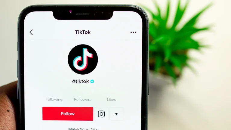
Unlocking booking potential: why tour and activity operators should embrace TikTok Marketing (with examples)
The Bókun Team • April 6, 2023
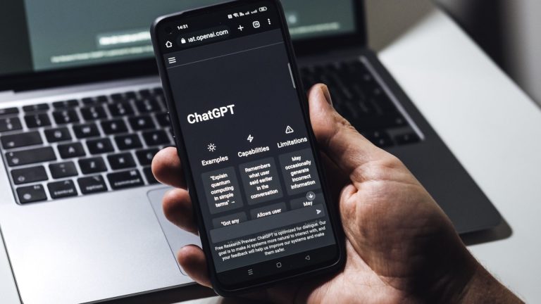
Understanding the future: How can tour and activity operators use ChatGPT & Generative AI

The Bókun Team • January 18, 2023
4 marketing tips you need to build a successful Lunar New Year campaign
![Top 6 features the right booking system should have in 2023 for tour and activity operators [+ free guide]](https://www.bokun.io/wp-content/uploads/2023/01/Blog_headers-768x432.png)
The Bókun Team • January 13, 2023
Top 6 features the right booking system should have in 2023 for tour and activity operators [+ free guide]

The Bókun Team • November 30, 2022
7 travel and tourism trends in 2023 for tour and activity operators
![4 last-minute tour operator Black Friday Marketing Strategies [+free checklist]](https://www.bokun.io/wp-content/uploads/2022/11/pexels-photo-3769747-1920w-768x501.jpeg)
The Bókun Team • November 21, 2022
4 last-minute tour operator Black Friday Marketing Strategies [+free checklist]

The Bókun Team • November 10, 2022
How to make the right connections and find the best partners to increase revenue

The Bókun Team • September 21, 2022
6 reasons why your tour operator website needs booking widgets

The Bókun Team • September 1, 2022
Tour operator website design: 6 elements that make or break your website

The Bókun Team • August 3, 2022
How to set up your team for collaboration in Bókun

The Bókun Team • July 8, 2022
4 reasons to run your ground operations with the Bókun mobile app

The Bókun Team • June 1, 2022
Selling to an international crowd with Bókun

The Bókun Team • May 17, 2022
GetYourGuide and you: Why you should connect Bókun to your GetYourGuide account
The Bókun Team • April 28, 2022
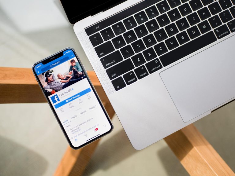
Facebook Pixel: What is it and why you should use it

The Bókun Team • April 20, 2022
Bókun partners with PaxFlow to help tour operators with customer self-service tools for booking management

The Bókun Team • April 19, 2022
Bókun vs. Viator – are they the same?

The Bókun Team • April 12, 2022
How to choose your reservation system and why Bókun

The Bókun Team • November 3, 2021
How Visit Rovaniemi sold €1M of bookings with local suppliers via Bókun

The Bókun Team • November 3, 2021
Bókun opens new doors for tourism businesses, according to TEN90 Digital
The Bókun Team • November 3, 2021
Grupo Xcaret descubre el mundo de los channel managers para Actividades y Tours
The Bókun Team • November 3, 2021
Grupo Xcaret discovers the world of channel managers to bring experiences online

The Bókun Team • September 15, 2021
Bókun named 2021 GetYourGuide Advanced Connectivity Partner

The Bókun Team • August 27, 2021
What can you do when industry conferences and events are not happening?

The Bókun Team • August 26, 2021
5 uses for the Bókun Marketplace that might surprise your revenue person
The Bókun Team • August 23, 2021
Everything you weren’t sure you needed to know, but are glad you found out, about Bókun Widgets

The Bókun Team • July 20, 2021
New Product Launch: An easier way to communicate with your customers

The Bókun Team • July 1, 2021
Bókun: Now with more features included!

The Bókun Team • March 16, 2021
Collaboration is key for travel recovery

The Bókun Team • March 9, 2021
How do I start a website for my tours and activities

The Bókun Team • March 8, 2021
Be in front of your travellers with Bókun’s cross-selling network
The Bókun Team • February 4, 2021
Bókun and JTB launch JTB BÓKUN for tour operators in Japan

The Bókun Team • February 4, 2021
Don’t miss a thing, sync your bookings to your Google Calendar for free

The Bókun Team • February 2, 2021
Show off your awesome Tripadvisor reviews to boost conversions!
The Bókun Team • January 28, 2021
Manage your business real-time with the free Slack integration

The Bókun Team • January 18, 2021
Make your business more powerful with the Bókun App Store

The Bókun Team • October 28, 2020
Get free Viator product quality reviews (with Bókun)

The Bókun Team • October 26, 2020
We are a Viator Top Connectivity Partner!


The Bókun Team • September 18, 2020
Secure your online bookings with Enhanced Refund Terms

The Bókun Team • August 13, 2020
How Tours & Activities Can Utilize Search Engine Marketing (SEM) to Get Direct Bookings
The Bókun Team • July 29, 2020
Travel SEO for Dummies: How to Go from Zero to Hero

The Bókun Team • July 22, 2020
8 Fascinating Ways Digital Marketing Can Help Tours & Activities Operators Win BIG in the New Normal

The Bókun Team • July 21, 2020
They’re here! You can now add gift cards to your product range

The Bókun Team • July 16, 2020
SEO crash course: Why is SEO important for your tours and activities business

The Bókun Team • July 13, 2020
Upsell post-checkout and boost your online sales

The Bókun Team • July 1, 2020
Product update: The Bókun Website Builder is now easier than ever to use

The Bókun Team • June 25, 2020
It’s time to get back to work, but is everyone ready?

The Bókun Team • June 23, 2020
Top-of-mind for travelers post-COVID
The Bókun Team • June 9, 2020
How Bókun can help to manage your business online

The Bókun Team • May 27, 2020
Prepare your business for post-COVID travelers

The Bókun Team • May 26, 2020
3 tips to get the most out of the Bókun Marketplace
The Bókun Team • May 18, 2020
How to get more bookings: Consider local hotels
The Bókun Team • May 15, 2020
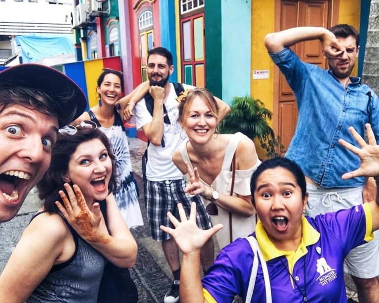
How Monster Day Tours makes the best of the COVID downturn

The Bókun Team • May 14, 2020
How Hello! Tours remains optimistic during COVID
The Bókun Team • May 12, 2020
3 Reasons Why You Should Be Logging Your Offline Bookings

The Bókun Team • May 11, 2020
Should you start a blog for your business?

The Bókun Team • May 7, 2020
Google Lighthouse: What it is, and why it matters

The Bókun Team • April 24, 2020
4 requirements to succeed in 2020 and beyond

The Bókun Team • April 22, 2020
Now is a great time to ask past customers for reviews
The Bókun Team • April 14, 2020
4 things to consider when starting virtual offerings

The Bókun Team • April 13, 2020
How can you start selling virtual tours today?

The Bókun Team • April 10, 2020
4 things people are searching for that we can’t ignore

The Bókun Team • April 6, 2020
Give your website a refresh with these quick tips

The Bókun Team • April 3, 2020
3 Easy ways to improve your website on mobile

The Bókun Team • March 29, 2020
Website best practices: Why mobile optimization should be at the top of your list
The Bókun Team • March 25, 2020
Product update: Navigation and marketplace enhancements

The Bókun Team • March 21, 2020
Gift cards: How you can benefit from promoting gift cards now
The Bókun Team • March 18, 2020
The Bókun Website Builder is here

The Bókun Team • March 12, 2020
Why reducing your cut-off time will result in more bookings

The Bókun Team • March 9, 2020