For years, Bókun has been the engine behind some of the world’s most extraordinary experiences – the booking and channel management solution trusted by experience operators and resellers worldwide. Internally, the story was clear: number one across major OTAs, powering millions of products every month. Externally, the brand still looked like just another quiet player in a crowded travel-tech category. It was time for the outside to finally match the inside.
The confidence gap
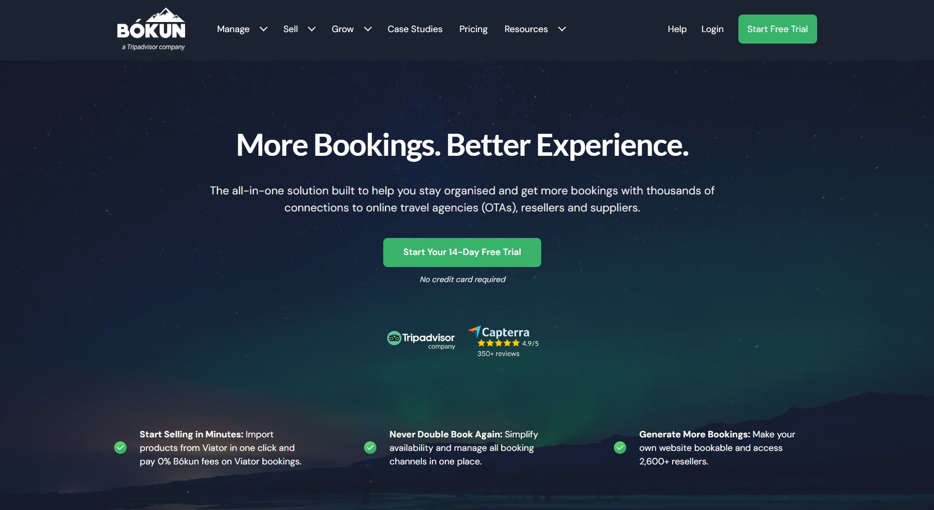
Our old look belonged to a different era of tech: safe blues, a literal mountain, and copy that focused on features, instead of the unforgettable moments operators create for their guests. It was professional, but it wasn’t distinctive – and it certainly didn’t feel like the leading platform for extraordinary experiences.
When we spoke to our team and our customers and mapped ourselves against the market, a pattern emerged: Bókun was often seen as a scrappy challenger, not the established leader it actually is. The result was a confidence gap – a mismatch between what Bókun delivers in reality and how the brand showed up in the world.
The strategy: own our leadership
Closing that gap meant getting honest about our role in the industry and the value we create every day. The brief was simple: build a brand that reflects a true travel‑tech powerhouse – bold, precise, and human.
To bring this new vision to life, we partnered with brand agency Simple Truth, whose strategic and creative collaboration helped us define and express Bókun’s true identity. Together, we built a brand that doesn’t just look different – it feels unmistakably like the market leader we’ve become.
Four principles guided every decision:
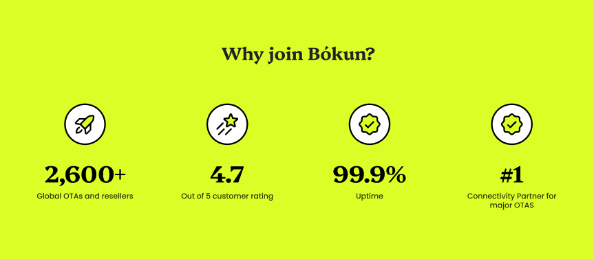
- From humble to leader: Speak with quiet authority and state the facts plainly – number one across major OTAs, rock‑solid reliability, and proven results for operators and resellers.
- Escape the blue: Step out of the sea of corporate blues with a visual identity that is unmistakably ours.
- Inject passion: Bring the energy of real‑world experiences into our design, language, and product storytelling.
- Honour our roots: Keep a clear nod to Iceland – the land of ice and fire – while recognising that we are a global brand, with operators and resellers in all corners of the globe.
The reveal: bold by design
“In the past, our brand didn’t fully reflect what we do,” said Ian Macleod, Director of Marketing at Bókun. “This isn’t just a new look – it’s a new way of showing the world who we are. Bold, confident, and purpose-driven, our brand now matches the ambition and energy of everything Bókun delivers.”
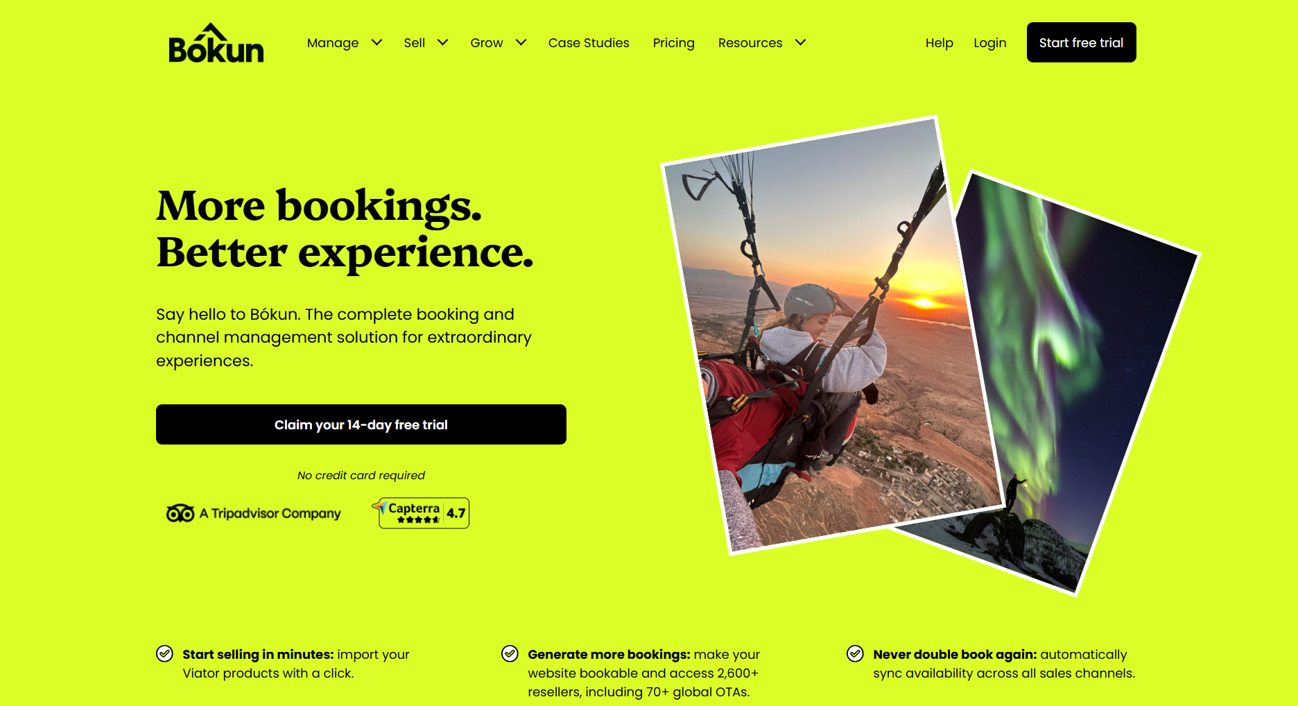
The new Bókun identity is built to cut through: confident, energetic, and impossible to ignore. It brings together a sharper visual system, a clearer promise, and a personality built around the balance of precision and passion.
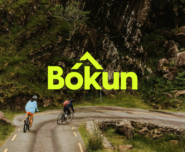
- The logo: The literal blue mountain is gone. In its place: a sharp, abstract peak in neon green – a forward‑moving signal of ambition, grounded in our Icelandic origin story.
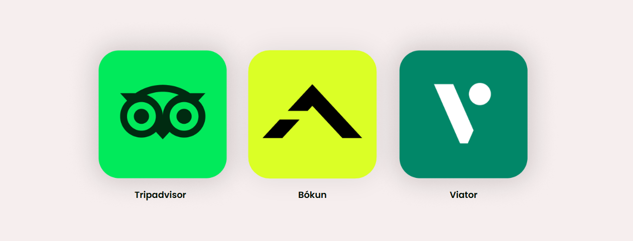
- The colour: Bókun has turned green. Our neon palette breaks decisively from corporate blue and aligns us more closely with the Tripadvisor family, while still feeling distinctly Bókun.
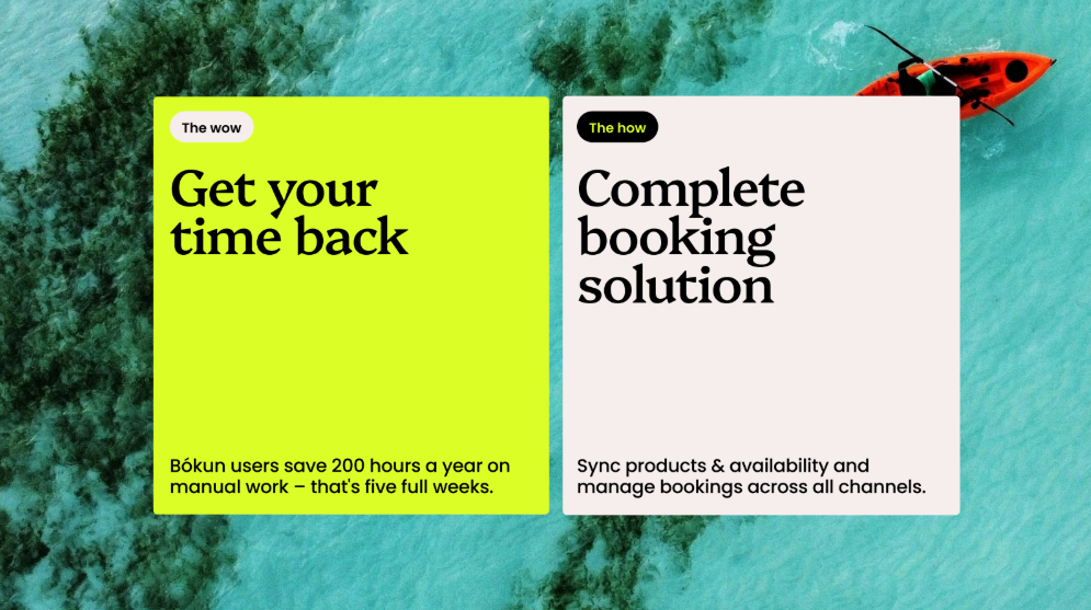
- The tagline: “The how to your wow” distills what we do in five words – solid technology as the how, unforgettable guest moments as the wow.
Ice and fire: the personality behind the brand
Our new voice is built on the same duality that defines Iceland itself: ice and fire. It shapes how we speak, how we design, and how we show up for experience providers every day.
- Ice – Cool confidence and sharp precision: We let the numbers speak, write with clarity, and cut anything that doesn’t help operators and resellers decide, act, or grow.
- Fire – Human warmth and bold energy: We sound like real people, not platforms – passionate about solving problems, excited about what our customers make possible, and focused on their guests, not our features.
This is the balance at the heart of Bókun: rock‑solid operations behind the scenes, with all the energy focused on the experiences that travellers remember.
The “How–Wow” lens
Our brand promise and tagline is simple: Bókun is the how to your wow. The How–Wow Framework turns that promise into a practical way of telling our story – in marketing, in product, and in everyday customer conversations.
- The WOW: The outcome that matters to our customers – a sold‑out tour, a flawless event, a calendar full of peak‑season bookings.
- The HOW: The specific feature or workflow in Bókun that makes it possible – from offline bookings to channel management, automation, and pricing tools.
This structure forces every message to lead with the result, then show the mechanism. No fluff, no feature lists – just clear value, and the tech that delivers it.
You will see this everywhere: in ads that speak directly to full calendars and higher margins; in product stories that start with fewer double‑bookings and less admin, and in an interface that feels as clean and deliberate as the brand that surrounds it.
A truer reflection of our power
This refresh is more than a new logo and a new colour; it is a reset in how Bókun shows up for the experience operators and resellers who rely on it. The confidence gap is closed: the brand now reflects the scale, reliability, and ambition of the platform that sits behind it.
Bókun is the how to your wow – powering the rock-solid operations behind the scenes, so you can focus on creating extraordinary experiences.
Ready to see what a brand that truly matches its ambition can do for your business? Let’s turn your wow into results.